Case study: Real estate open home app reimagined
An app to help property managers run open inspections.
Client
Lululiv
Specific Role
UX Design
UI Design
Problem statement & the process
Defining the problem we're solving
Problem
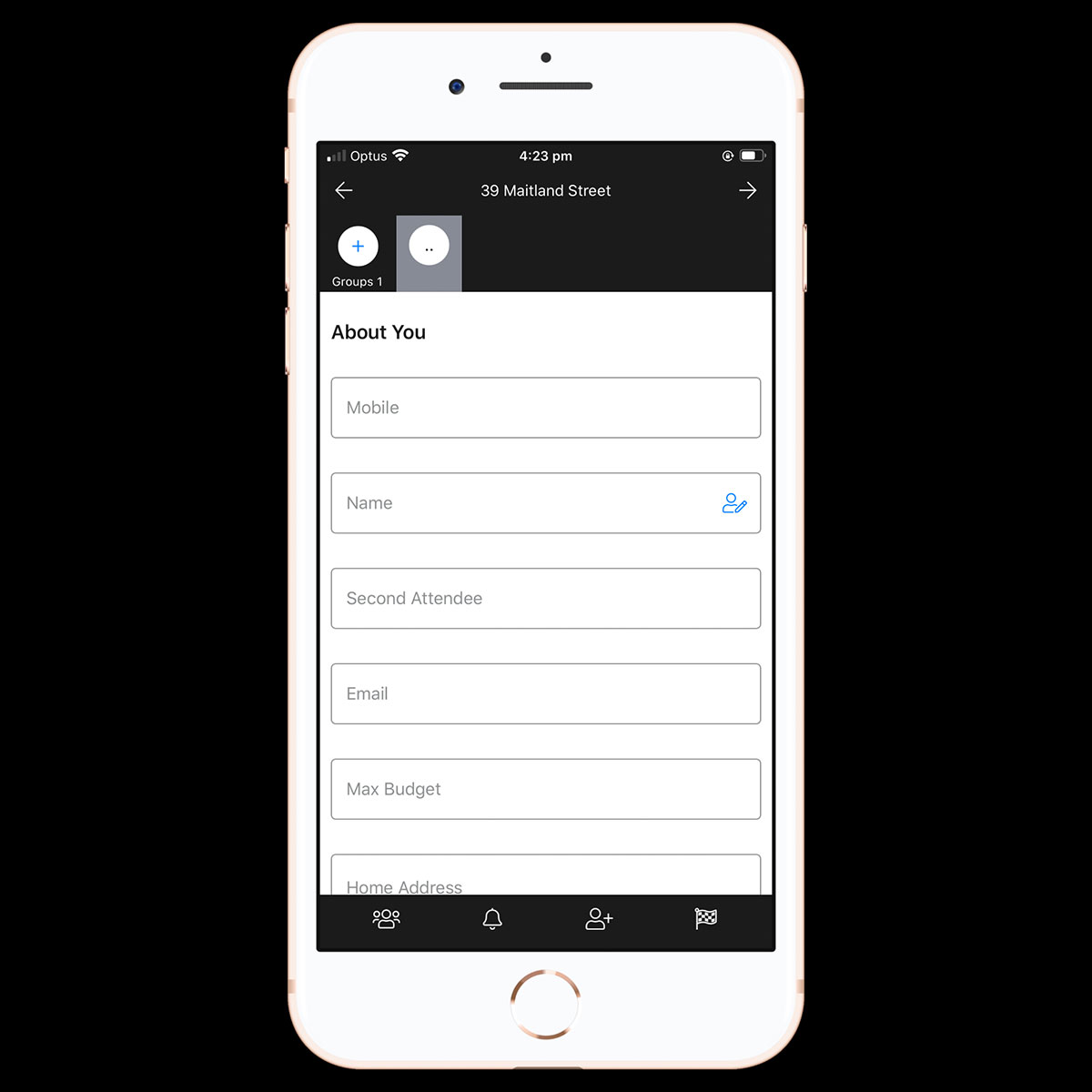
The Open Home app was functional but complex. Agents in the field struggled to understand the UI and add visitors quickly, sometimes reverting to pen and paper.
The Process
We applied a design-thinking approach—interviews and feedback loops—to reimagine a lower-friction experience for agents.
The process
Talking to agents using the app surfaced core frustrations and how they impacted credibility when opening a home. After empathising with the user base, we defined the desired outcomes for agents to succeed.
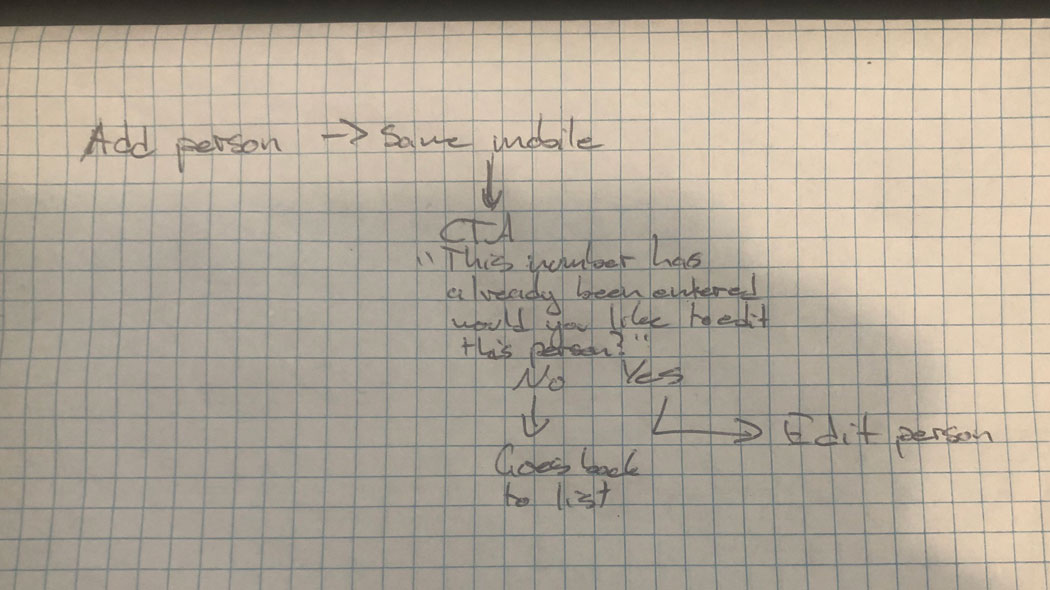
Before sketching, I mapped a simple user flow for the core job: add a visitor quickly and reliably. Interesting findings emerged:
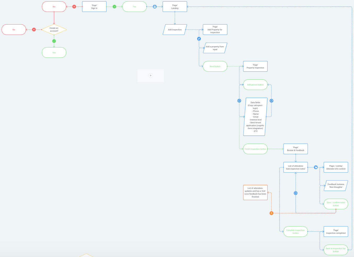
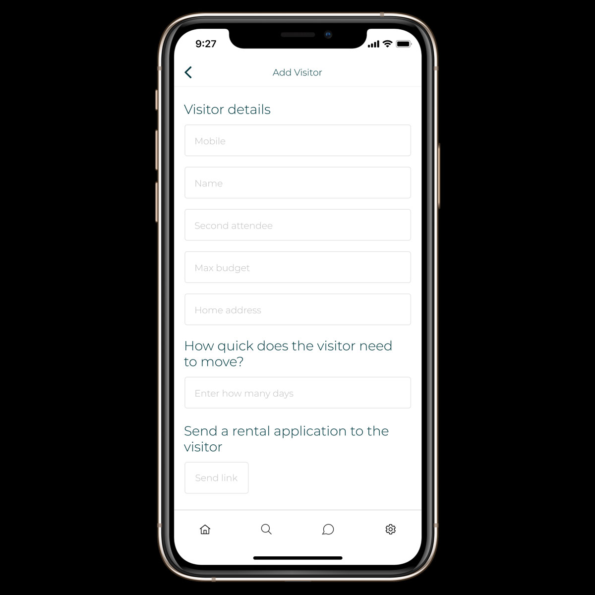
Stripping the process back to the key requirement—“add visitor details easily and quickly.” From login to property selection to the first visitor, the flow then loops efficiently.
“This addressed the biggest issue: complexity and high interaction costs.”
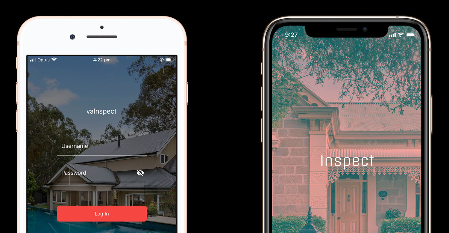
I sketched rapidly on paper to iterate, then moved into Figma for a medium/high fidelity prototype tailored to a more visual stakeholder group.
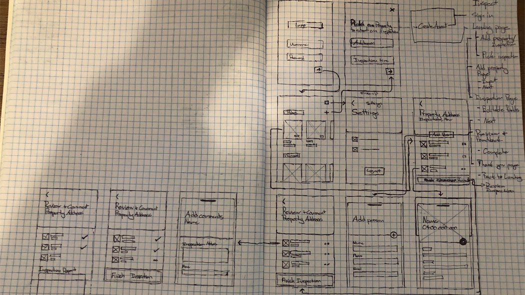
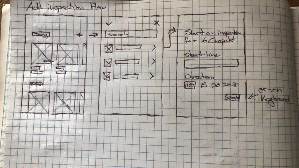
Paper is still my fastest way to explore divergent ideas and converge on the best ones. 😄
Next, I created a higher-fidelity prototype in Figma to present to stakeholders. While I prefer starting reviews with sketches, this audience responds best to polished visuals.
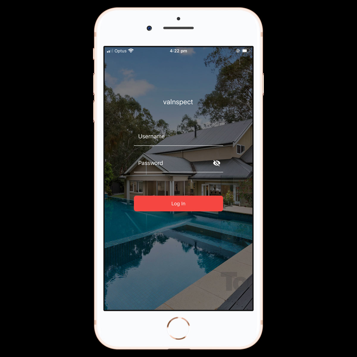
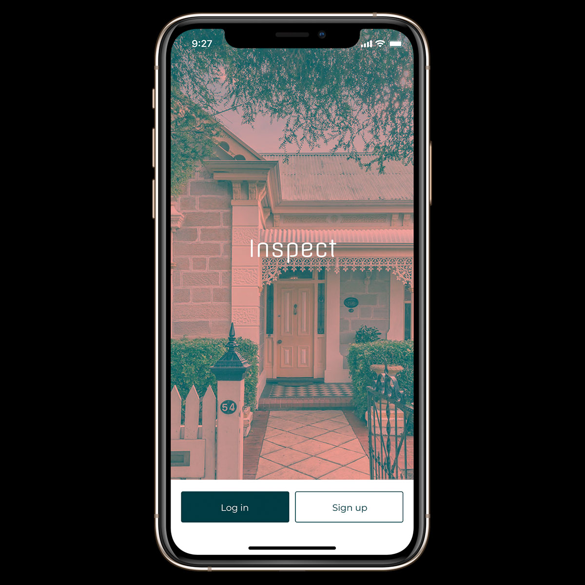
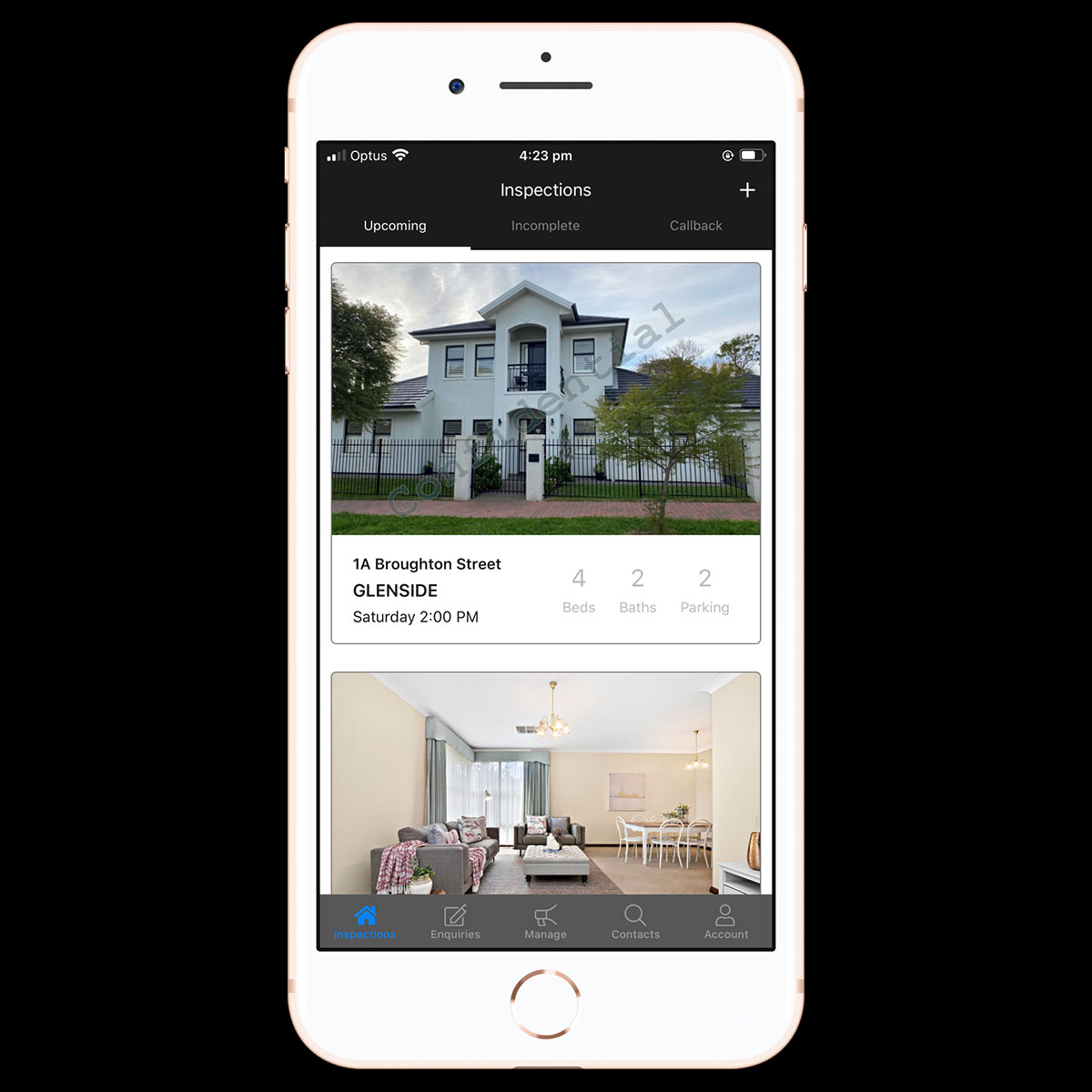
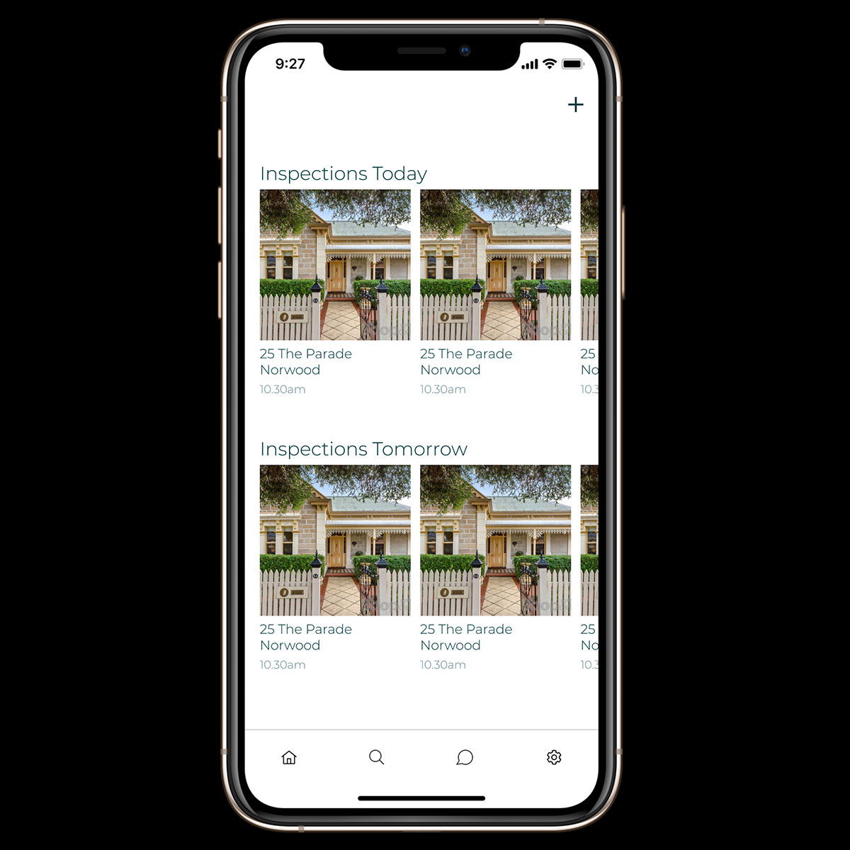
Here are a few before/after screens where we reduced friction and addressed the biggest pain points in-field: